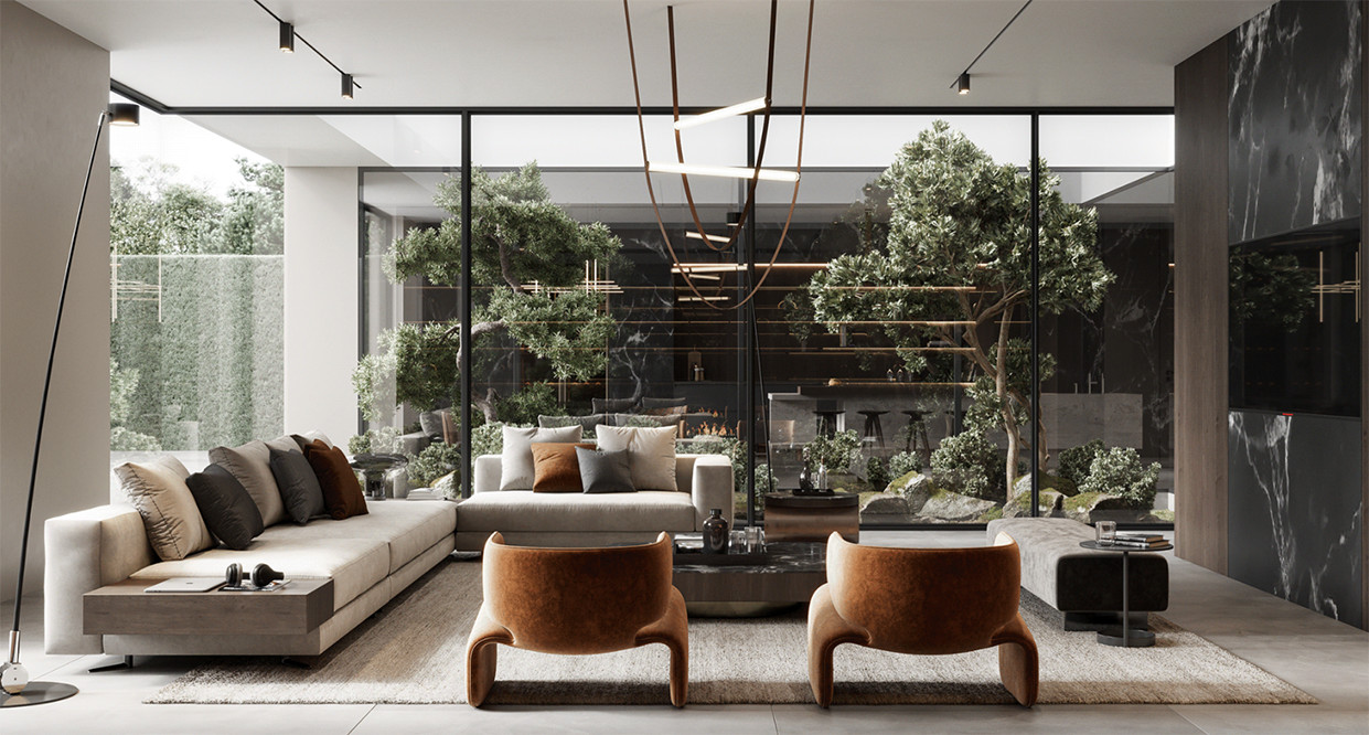

Interior Design Science: The Psychology of Color
When you think of an interior designer, you’re probably not considering that they share some common job traits with environmental psychologists. The art of design and the science of the way we think are more closely linked than many of us think. This is especially true when it comes to the link between interior design and the psychology of color.
Have you noticed that most fast food locations had red as a core color? Reds boosts the feeling of hunger. Do you wonder why offices are usually a drab gray? It’s because gray is a calming color and supports concentration and in turn workers will be more focused on their work.
Brand designers have been using color psychology for many years. Have you noticed Coke Zero is black? It’s because men respond more to the black than the silver of Diet Coke. Now think about how many brands geared toward men have black in their color scheme. According to the American Society of Industrial Design, science can help designers how and why clients respond to their work. Thus, increasing the likelihood of success.
Scientific research has proven that certain colors make people feel better and more happily live in their homes. For example, in one study a woman who was losing her vision demanded a bright fuchsia be used in her office.
In an office, for example, you don’t want to use red because it hinders memory. To add brightness, think legal pads instead, and go with a yellow because yellow helps with memory.
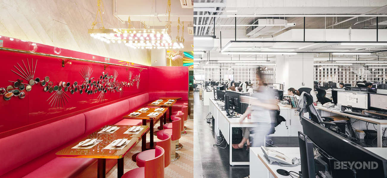
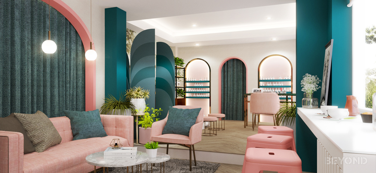
 “FIKA NAIL SALON & COFFEE SHOP” – Town in Town
For the woman who wanted fuchsia in her office, the interior design team used fuchsia as an accent color in the top third of the wall. This was so it could be seen when entering, and then above level once the woman started her work.
By utilizing scientific research, interior designers deliver what the client wants, but sometimes, without the client even knowing how or why they love a space or design element.
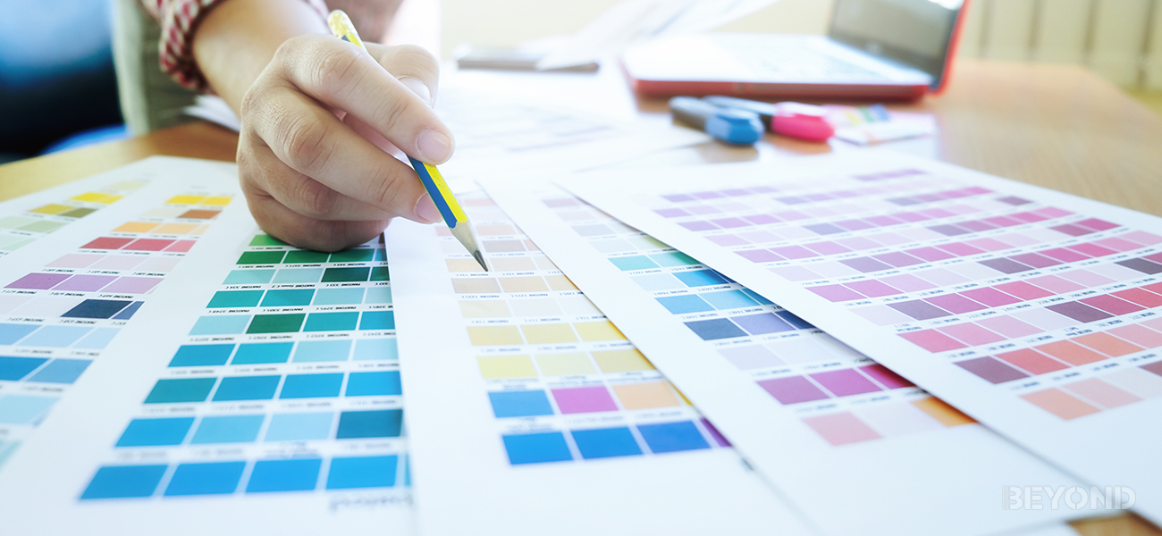
Not sure how different colors affect your mood? Let’s take a look at the spectrum!
BLACK is a color of intimidation but can also seduce when used in small amounts.
BLUE is a calming color that’s associated with strength, trust, and dependability.
We closely link GREEN with the environment and can be used to relax or refresh.
PINK is the color of sympathy. It calms, nurtures, and comforts.
PURPLE inspires, encourages, and uplifts.
RED evokes powerful emotions such as fear and anger as well as more passionate emotions.
WHITE refreshes and provides balance.
YELLOW is the color of sunshine and it puts people into a happy and joyful mood.